


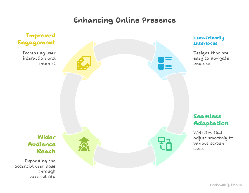
In today��s digital landscape, having a website that performs flawlessly on mobile devices isn't just a luxury��it's a necessity. With the majority of web traffic coming from smartphones and tablets, a poor mobile experience can directly impact your bottom line. When deciding how to optimize your online presence for these users, you��ll primarily encounter two options: a responsive website or a dedicated mobile site. Understanding the difference is crucial to making the right choice for your business.
A responsive website is the modern, highly recommended standard. Built using a flexible Responsive Website Design approach, a single site dynamically adapts its layout, images, and content to fit any screen size��from a desktop monitor to a smartphone. This is achieved through fluid grids and CSS media queries. The core principle is "one website, one URL," which provides a consistent user experience and is significantly easier to manage. You only have one site to update, one set of content to maintain, and it seamlessly meets the needs of all users. For most businesses, investing in professional Responsive Website Design Services is the most efficient and future-proof solution.
Conversely, a dedicated mobile website (or m.dot site) is a separate entity built exclusively for mobile users. It often resides on a subdomain (like m.yourwebsite.com). When the server detects a mobile device, it redirects the user to this mobile-specific version. While this allows for a highly tailored mobile experience, it comes with significant drawbacks. You are effectively managing two separate websites, which doubles the development, maintenance, and SEO efforts. Content must be updated in two places, and you risk issues with inconsistent messaging and search engine indexing.
So, which one do you really need?
For the vast majority of businesses, a responsive website is the clear winner. Here��s why:
SEO Friendly: Google explicitly recommends responsive design. Having a single URL for all content makes it easier for Google to crawl and index your site, improving your search rankings.
Easier Maintenance: Updating content, products, or blog posts only needs to be done once, saving you time and resources.
Future-Proof: A responsive design automatically adapts to new screen sizes and devices, protecting your investment as technology evolves.
Consistent User Experience: Your brand and content remain uniform across all platforms, building trust and familiarity with your audience.
Dedicated mobile sites are typically only necessary for extremely complex web applications that require a fundamentally different mobile user interface than their desktop counterpart.
Ultimately, partnering with an expert provider of Responsive Website Design Services ensures you get a single, agile website that delivers an exceptional experience to every user, regardless of how they find you. It��s the most strategic, cost-effective, and sustainable choice for your online success.
